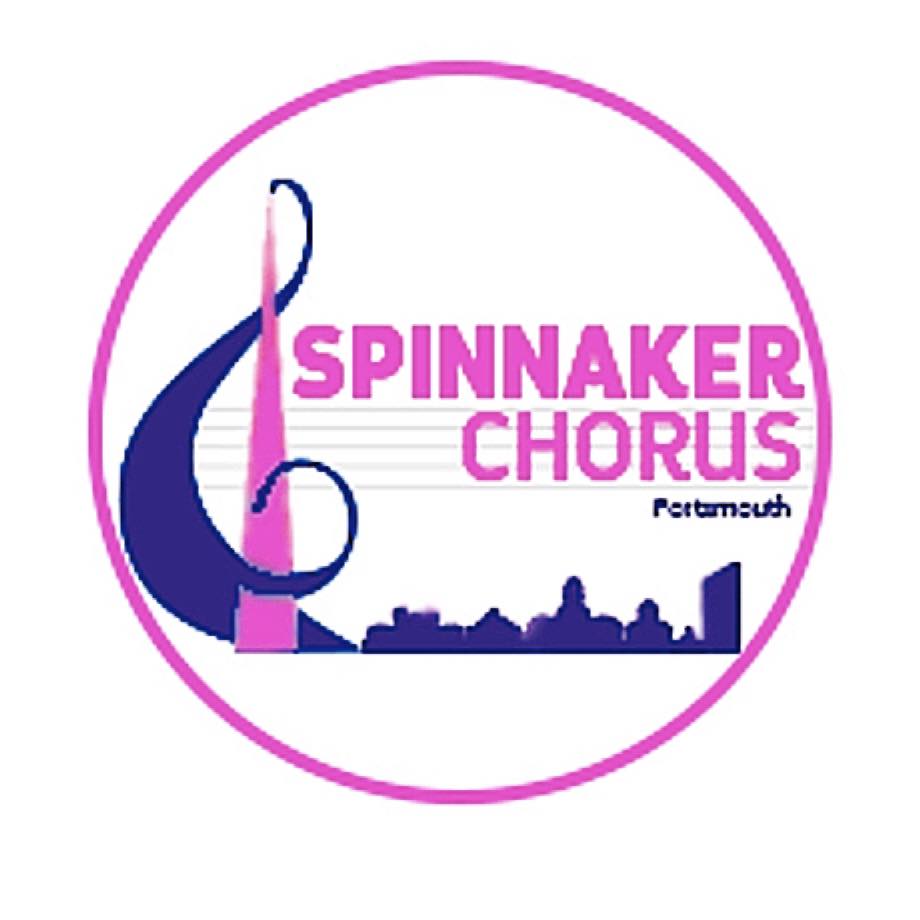
Spinnaker has a NEW logo!

| Type of post: | Choir news item |
| Sub-type: | No sub-type |
| Posted By: | Tracy Daniel |
| Status: | Current |
| Date Posted: | Mon, 10 Oct 2022 |
Unveiling our new Spinnaker Logo!
It has been a while since we reviewed our logo and felt it was time to refresh it with a design more suited to current times. Spinnakerette and D&I Representative Nicolette who is also a hugely talented designer was set the challenge of designing a new logo for us.
She said ‘The Board wished to reflect our unique Spinnaker culture and the pride we share in our chorus with a logo that would be more inclusive and appeal to diverse audiences in alignment with LABBS increased focus on D&I. There was also the desire to make musical reference to our hobby as well as to our regional pride with Portsmouth as our city and its maritime heritage.
In the logo we have a pink stylized Spinnaker Tower which also forms an intrinsic part of the treble clef. It is a ‘billowing sail’ treble clef with a hint of wave and things nautical and the horizontal tower beams merge into the musical stave to the right hand side. The Spinnaker font has been updated and is now more contemporary in feel and the Portsmouth cityscape shows city landmarks such as the Lipstick Tower, Football Stadium and the Guildhall, the steps of which have played a notable role in our post lockdown ‘come-back’. We hope that the logo resonates with you all at some personal level as we enter a new chorus chapter in our new chorus home and moving towards Convention’22 exciting times!
We are thrilled with our new logo and look forward to displaying it with pride for years to come, well done Nicolette, you are a star!


